Lyngby Tandplejecenter

A website for Lyngby Tandplejecenter, bringing together the clinic’s images, graphic identity and treatment information in a bright, calm visual world. The project was created in collaboration with graphic designer Carina E.

The creative work centres on consistency. Photographs introduce people and surroundings, while typography, colour and layout give the information a clear framework. Visitors should be able to get a sense of the clinic and find their way to booking and contact without losing their bearings.

Website

— for Lyngby Tandplejecenter

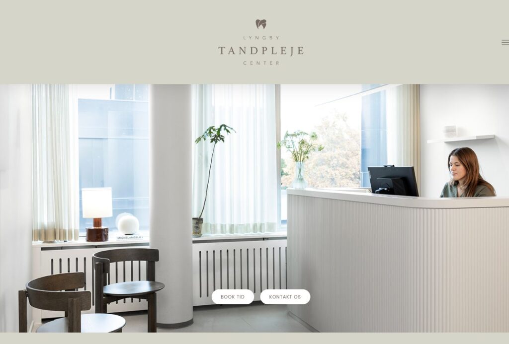
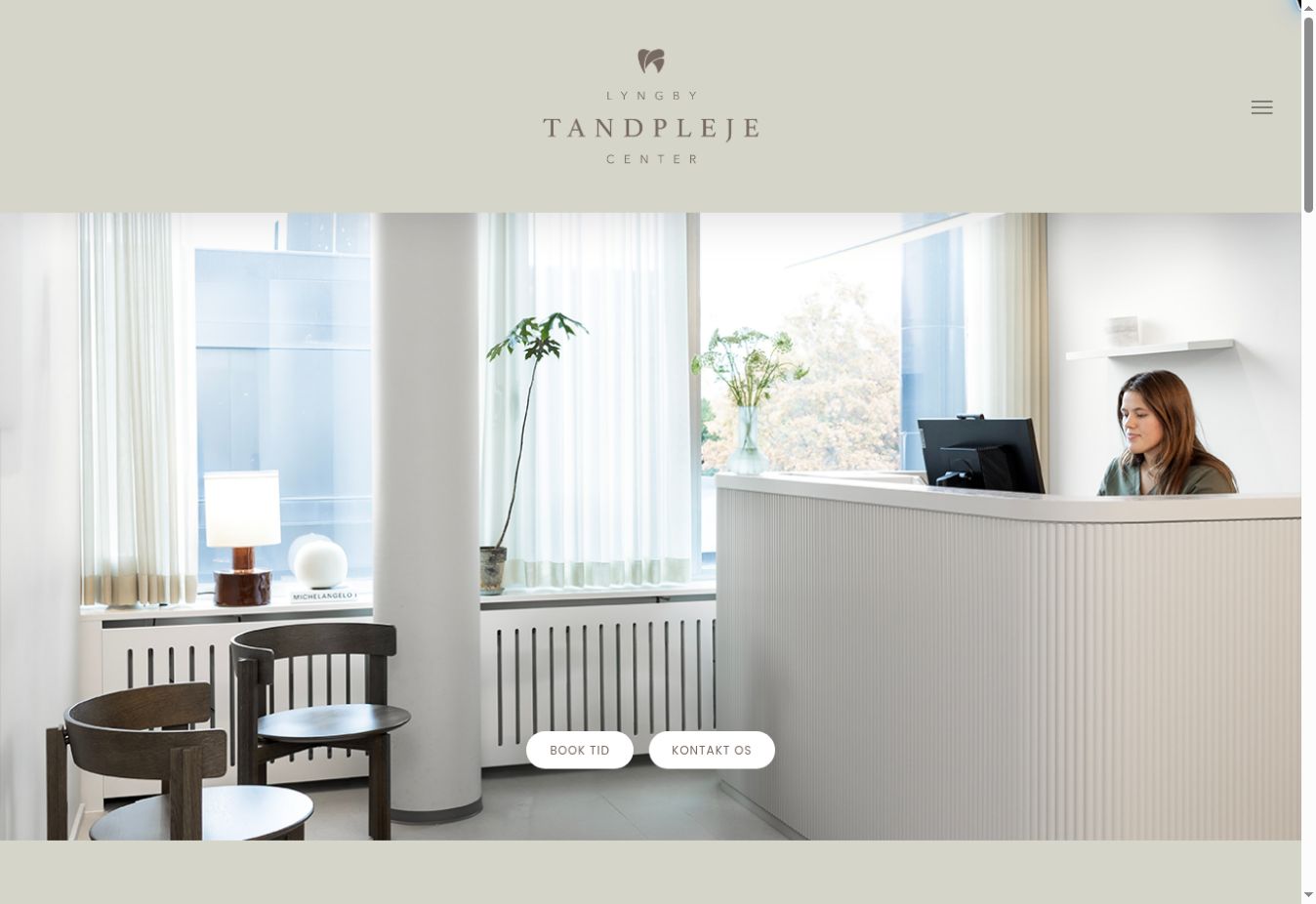
Bright spaces, soft tones and simple navigation frame the clinic’s digital expression. Photographs have room to breathe, while the text remains readable and easy to navigate.

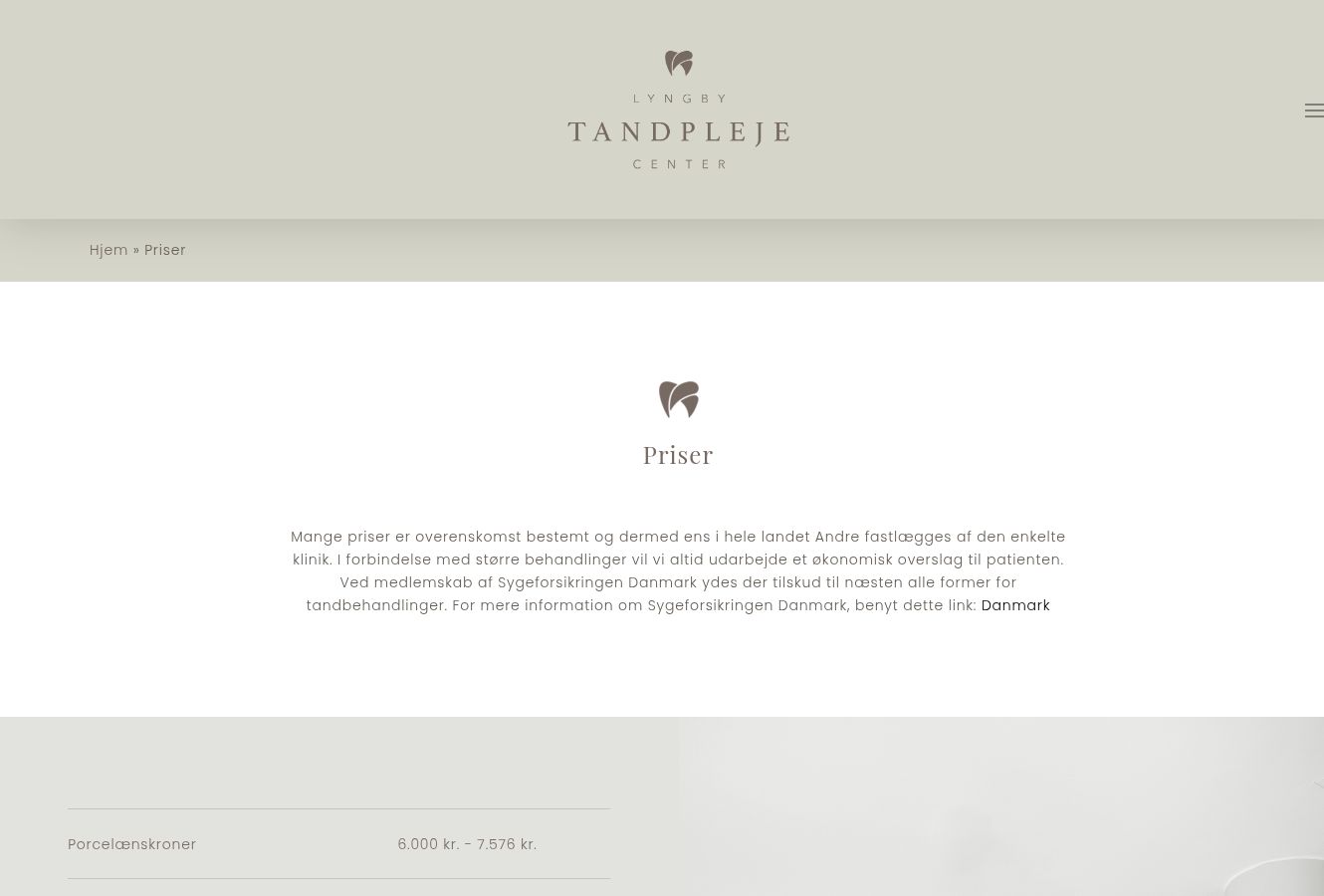
Treatments, prices and practical details serve different purposes. A familiar hierarchy helps visitors move from an introduction to the information they are looking for. Images, headings and buttons therefore work together as parts of one visual story, with the content determining what needs attention on each page.

Web design

— in detail

The collaboration with Carina E. connects the graphic work with the digital experience. On the website, the identity needs to work in specific situations: on the homepage, in the team presentation and on pages containing practical information.

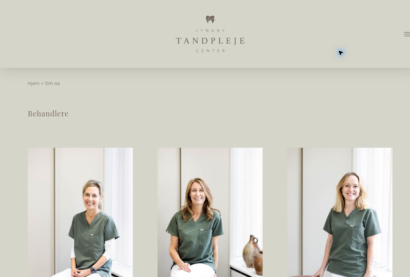
These views show how photography and design complement each other. The homepage introduces the clinic, the team section puts faces to the practice, and the pricing page makes room for structured reading. Consistent visual choices connect the pages while allowing the content to set the pace. On mobile, images and text still need to work together, with a clear route to booking and contact.


Let’s talk.

Contact

A project in mind? Send me a few lines.